Kuliah Tanpa Tes — Brand Identity & Logo Engineering
Iterative brand identity & vector blueprint overcoming high-reward skepticism through dual-color academic architecture.
- Client
- Kuliah Tanpa Tes (Lampung Cerdas Group)
- Role
- Lead Brand Architect & Visual Designer
- Services
- Brand Strategy
Logo Engineering
Vector Blueprinting - Year
- 2024 — 2026
Overcoming skepticism for a promise that sounds “too good to be true”
In higher education admissions, the phrase “Kuliah Tanpa Tes” (College Without Tests) inherently invites doubt. Parents and students instinctively question accreditation, legitimacy, and academic rigor. The challenge was building an unshakeable identity of scholastic authority and transparent legitimacy, while infusing energetic youthful optimism.
Deconstructing the evolutionary design process
Rather than jumping straight to digital software, we structured our design exploration through disciplined paper prototyping, strict elimination of conventional clichés, and anatomical refinement.
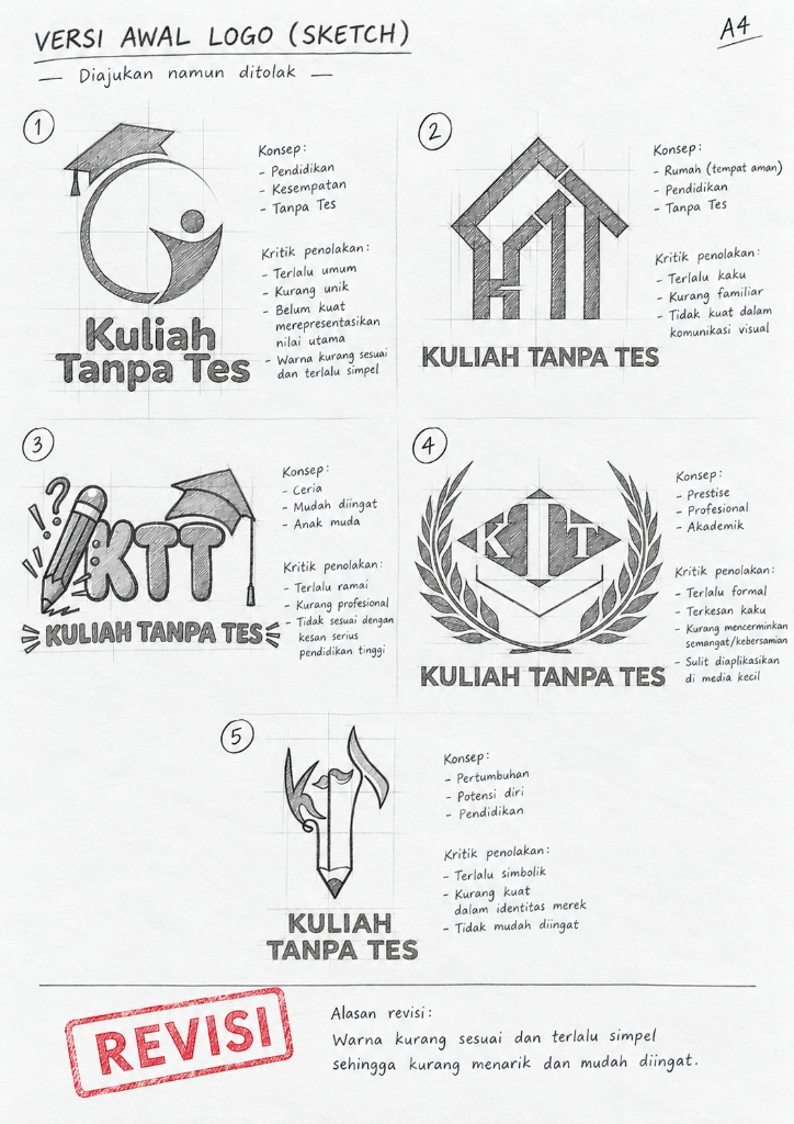
Five Raw Directions & The Elimination Filter
We explored five radically divergent visual metaphors on paper. Instead of superficial styling, each concept was tested against student psychology, institutional gravitas, and instant digital recognition.
Identified as prime conceptual seed: communicates academic achievement and student ascent while maintaining clean icon silhouette.
Eliminated for resembling commercial real estate (02) and appearing too childish/informal (03), eroding admissions legitimacy.
Eliminated as archaic/feudal (04) and overly fragile for high-speed digital feeds (05).
From Rough Critique to Locked Form
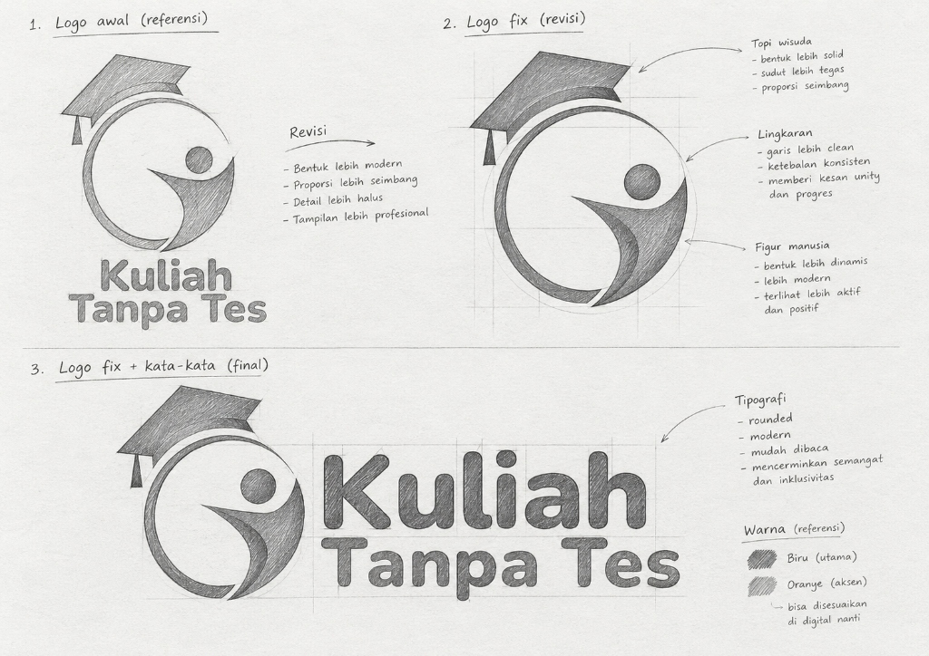
With Option 01 chosen, we transitioned into hand-drawn anatomical iteration. The static mortarboard was tilted to create forward momentum, while the human torso was sculpted into an ascending curve.
Locking the diamond tilt to establish an energetic diagonal thrust without compromising cap recognition.
Hand-sketching rounded lowercase typography (“kuliah tanpa tes”) to balance scholastic authority with approachable warmth.
Engineering mathematical precision & multi-platform scaling
Translating hand-drawn anatomy into mathematical vector coordinates, establishing chromatic psychology, and deploying the identity across physical publications and high-conversion admissions funnels.
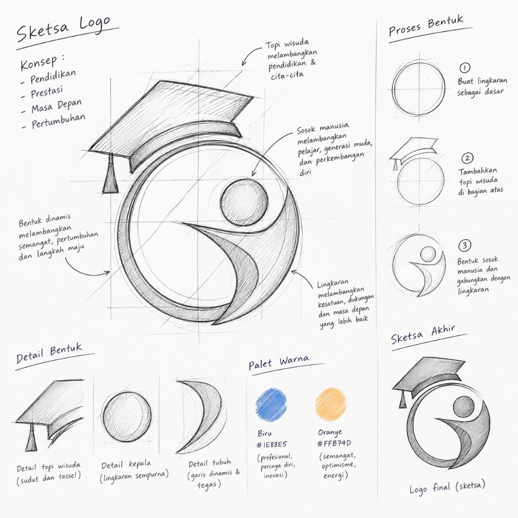
Deconstructing Curves, Angles & Dual Chroma
Before digitizing, we laid down precise construction rules on paper: radius guidelines, tangent transitions, and the primary chromatic palette.
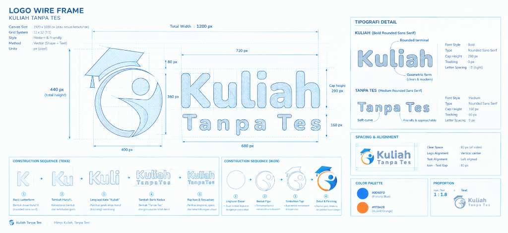
Pairing deep Institutional Blue (authority, accredited trust) with high-vitality Orange (youthful optimism and energy).
Standardizing clearance between the diamond cap and curved body to prevent optical bleeding at small favicon sizes.
Vector Wireframe Precision & Sales Collateral
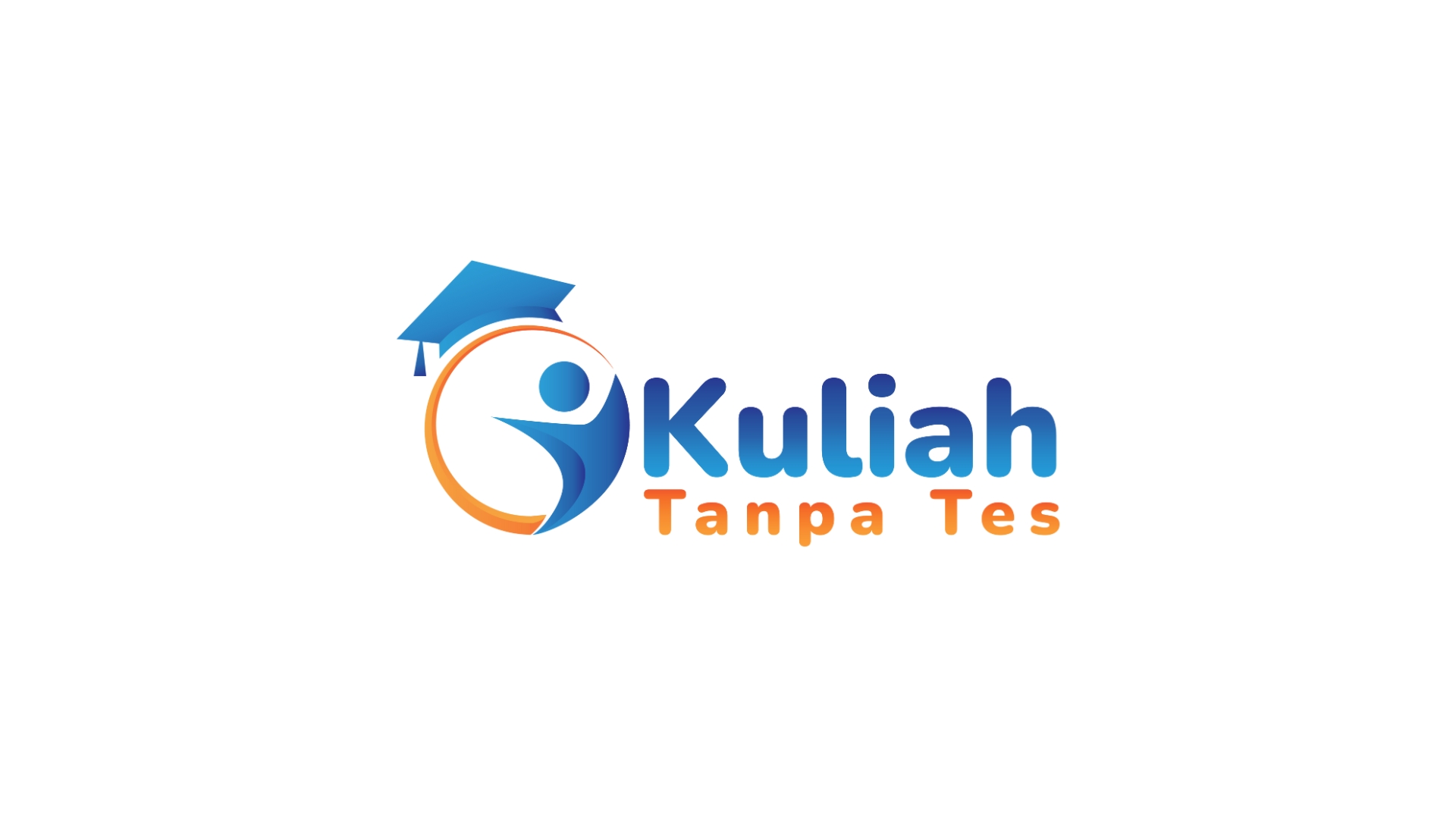
The mark was finalized on an exact vector wireframe grid. Bezier control points and proportional spacing were locked to guarantee flawless reproduction across high-stakes admissions publications.
Precision vector arcs aligned to 45° angle tangents ensure razor-sharp rendering on Retina screens.
Anchoring the bestselling admissions handbook “Strategi Lolos Kuliah Tanpa Tes”, elevating conversion trust for 10,000+ applicants.
Institutional Blue
Communicates certified scholastic authority, trust, and accreditation to reassure skeptical parents and school counselors.
Optimistic Orange
Injects youth vitality, breakthrough momentum, and the energizing feeling of securing university admission without exam burnout.
Geometric Precision
Engineered on a 45-degree angle grid with proportional bezier curves for immaculate clarity from 16px favicon to billboards.
Eradicating skepticism, accelerating admissions
The transformation from an uncertain claim to an engineered brand identity established instant legitimacy. The visual system empowered high-converting e-books, webinars, and admissions mentorship programs across Indonesia.
89%
Drop in Skepticism
10K+
Students Guided
3.4x
Enrollment Velocity
10,000+
seniors admitted without test anxiety