SNBT Plus - Brand Identity & Positioning
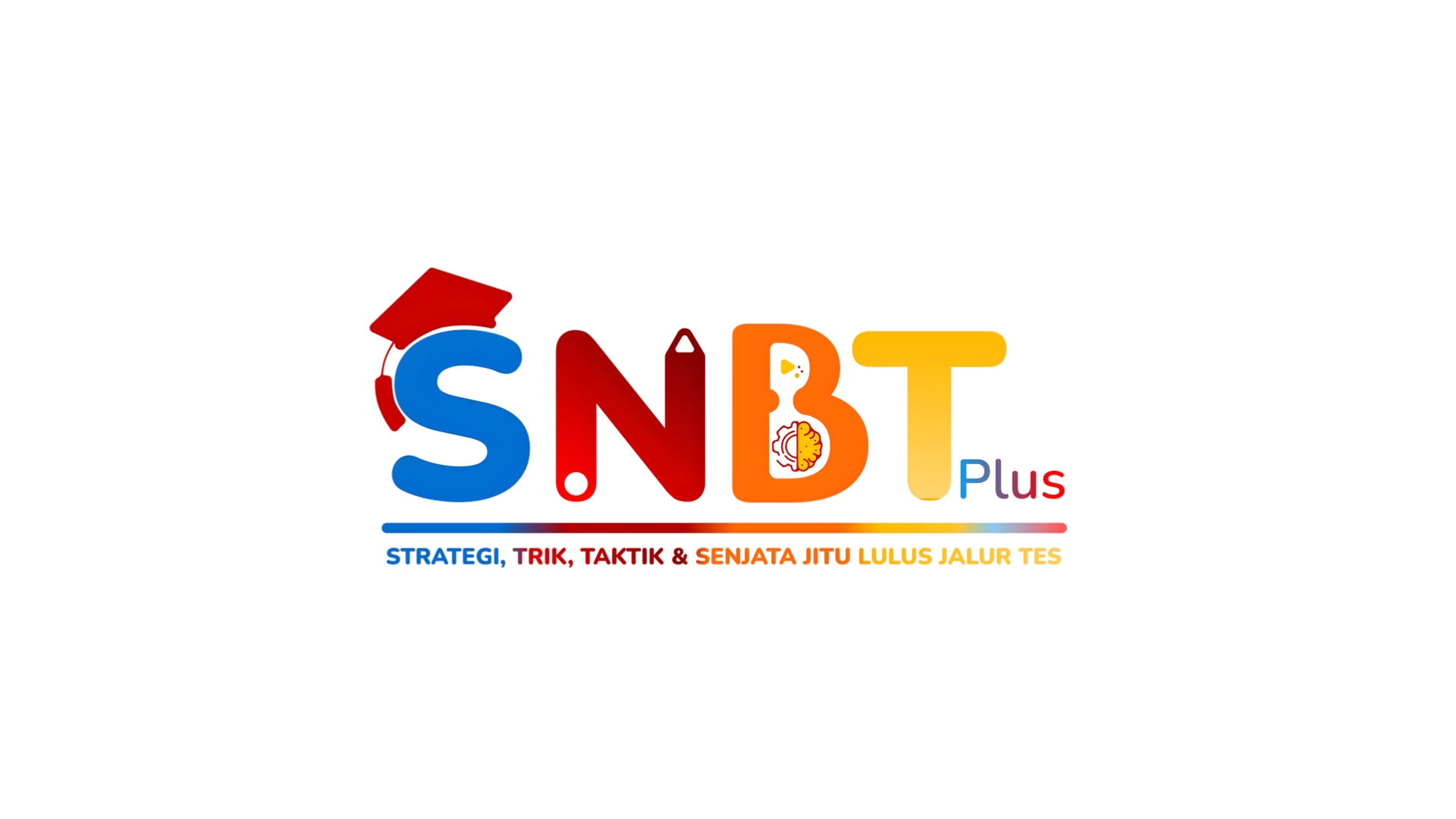
Developed a vibrant, illustrative wordmark logo and comprehensive brand identity system for SNBT Plus, a Gen Z-targeted test preparation service. Strategic brand positioning that balances approachability with authority.
- Project
- SNBT Plus - Brand Identity & Positioning
- Focus
- Brand Identity & Logo Design
- Scope
- Iconography Color Theory Typography
Turning a clear creative ambition into measurable impact
The SNBT exam is a high-stakes, high-stress event for students. The market for preparation materials is crowded, often falling into two unappealing categories: too formal (legacy brands that feel dated and disconnected from youth) or too chaotic (newer brands that are vibrant but lack credibility). The challenge was to strike a precise balance—de-stress the topic while building a strong sense of credibility, making test prep feel approachable and even fun.
A focused system built around the audience
Developed a vibrant, illustrative wordmark centered on the core philosophy of 'The Strategic Toolkit.' Visually deconstructed the 'problem' (SNBT) and embedded the 'solution' (Plus) within the design. The logo systematically explains its own value: 'S' topped with a mortarboard (university goal), 'N' containing a pencil (written test reference), 'B' with a glowing brain/lightbulb (critical thinking & solutions), and 'T' in bright yellow (clarity & success). The period acts as a visual full stop, separating problem from solution. 'Plus' appears in a rainbow gradient, representing the variety of solutions offered.
Custom Illustrative Wordmark Design
Integrated Iconography System
Multi-Color Strategic Gradient
Rounded, Friendly Typography
Clear Visual Hierarchy
Brand Guidelines & Applications
A stronger platform for continued growth
Created a distinctive, memorable brand identity that immediately resonates with Gen Z audiences. The logo serves as both a visual and conceptual anchor, clearly communicating the brand's unique positioning. The design successfully balances professionalism with youthful energy, making SNBT preparation feel less intimidating and more achievable. The multi-color gradient and custom typography ensure the brand stands out in a crowded market while maintaining credibility.
Key outcomes